Header
What this section does
Section titled “What this section does”The Header controls your store’s top navigation, logo behavior, and key utility links. This is the section merchants adjust most when changing site structure and brand presentation.
How to set it up
Section titled “How to set it up”- Go to Online Store -> Themes.
- Click Customize.
- In the left panel, open Header group -> Header.
- Save after checking both desktop and mobile previews.
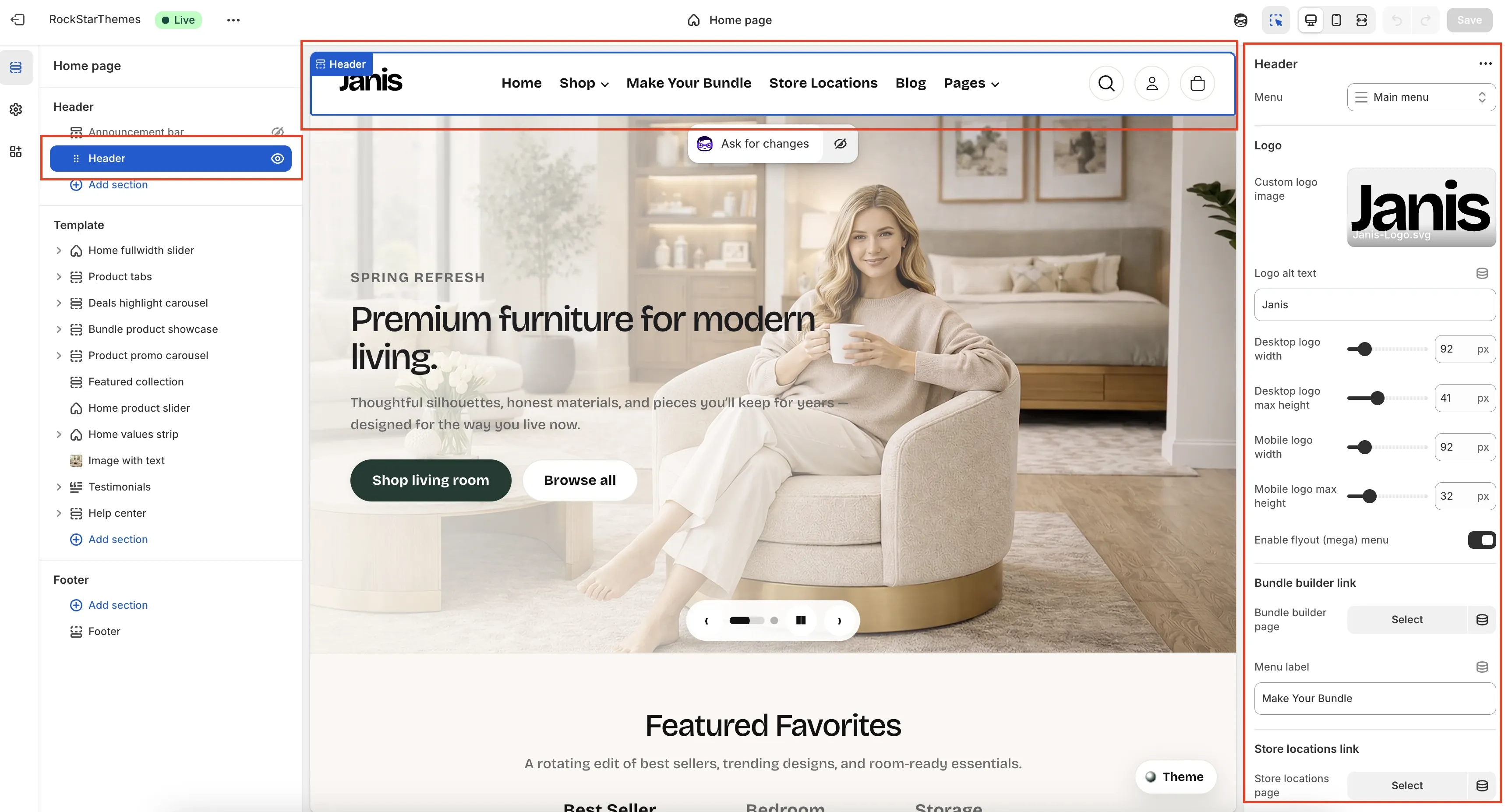
Editor Layout Overview
Section titled “Editor Layout Overview”- Left sidebar (Sections tree):
- Shows the current template structure.
Headeris selected.Add sectionadds new sections to the page template (not inside the header itself).
- Center preview (storefront canvas):
- The blue outline marks the selected Header section.
- You can visually confirm logo size, menu labels, and icon spacing here.
- Right settings panel (Header settings):
- This is where header behavior and content are configured.
- Top editor bar:
- Store name + live status.
- Current template/page selector (
Home page). - Device preview controls.
- Save button.
Header Items In The Storefront Row
Section titled “Header Items In The Storefront Row”These are the header elements visible in the preview:
- Logo (brand mark at left).
- Primary navigation links (
Home,Shop,Make Your Bundle,Store Locations,Blog,Pages). - Utility icons (Search, Account, Cart).
Header Settings Panel: Field-By-Field
Section titled “Header Settings Panel: Field-By-Field”- Menu (
Main menuselector):- Chooses the navigation source used for top-level links and dropdown structure.
- To change link order/items: go to Online Store -> Navigation -> Main menu.
- Custom logo image:
- Upload or replace the logo asset.
- Logo alt text:
- Accessibility text read by screen readers and used when image does not load.
- Desktop logo width:
- Controls rendered logo width on desktop.
- Desktop logo max height:
- Caps logo height on desktop layouts.
- Mobile logo width:
- Controls rendered logo width on mobile.
- Mobile logo max height:
- Caps logo height on mobile layouts.
Mega Menu
Section titled “Mega Menu”- Enable flyout (mega) menu:
- On: desktop dropdowns render as mega menu layout.
- Off: dropdowns render as simple submenu list.
Bundle Builder Link
Section titled “Bundle Builder Link”- Bundle builder page:
- Selects which page this nav item points to.
- Menu label:
- Sets the visible text (example:
Make Your Bundle).
- Sets the visible text (example:
Store Locations Link
Section titled “Store Locations Link”- Store locations page:
- Selects destination page for the store locations item.
- Menu label:
- Sets link text shown in navigation (for example
Store Locations).
- Sets link text shown in navigation (for example
Common Header Tasks
Section titled “Common Header Tasks”Change main navigation links
Section titled “Change main navigation links”- Open Online Store -> Navigation -> Main menu.
- Add, remove, rename, or reorder menu items.
- Save and return to Theme Editor to verify.
Add a new top-level nav item
Section titled “Add a new top-level nav item”- In Main menu, add a new top-level item.
- Add child items if it should open a dropdown/mega menu.
- Save and confirm behavior in desktop and mobile preview.
Disable mega menus quickly
Section titled “Disable mega menus quickly”- In Header settings, disable Enable flyout (mega) menu.
- Save.
Update bundle/store links
Section titled “Update bundle/store links”- In Header settings, choose the target pages for:
- Bundle builder page
- Store locations page
- Update each Menu label as needed.
- Save and test navigation links on the storefront.
- Keep top-level labels short for cleaner desktop layout.
- Set meaningful alt text for logo assets.
- Check both desktop and mobile preview before publishing.
- Save only after confirming all nav links resolve to the intended pages.
Why is my menu not updating in the header?
Section titled “Why is my menu not updating in the header?”The header pulls from the selected Menu setting. Confirm you edited the same menu handle
selected in Header settings (usually Main menu), then save and refresh preview.
Why did the mega menu stop showing?
Section titled “Why did the mega menu stop showing?”Check Enable flyout (mega) menu in Header settings. If disabled, dropdowns render as standard submenus.
Why does the logo look different on mobile?
Section titled “Why does the logo look different on mobile?”Desktop and mobile logo size limits are separate controls. Adjust the two mobile logo fields independently.
Related guides
Section titled “Related guides”Need help?
Section titled “Need help?”If you still need help, contact support via the Contact page.