Home Fullwidth Slider
What this section does
Section titled “What this section does”This section controls the homepage hero slider, including slide media, copy, motion, and content panel styling.
How to set it up
Section titled “How to set it up”- Go to Online Store -> Themes.
- Click Customize.
- Make sure the template is Home page.
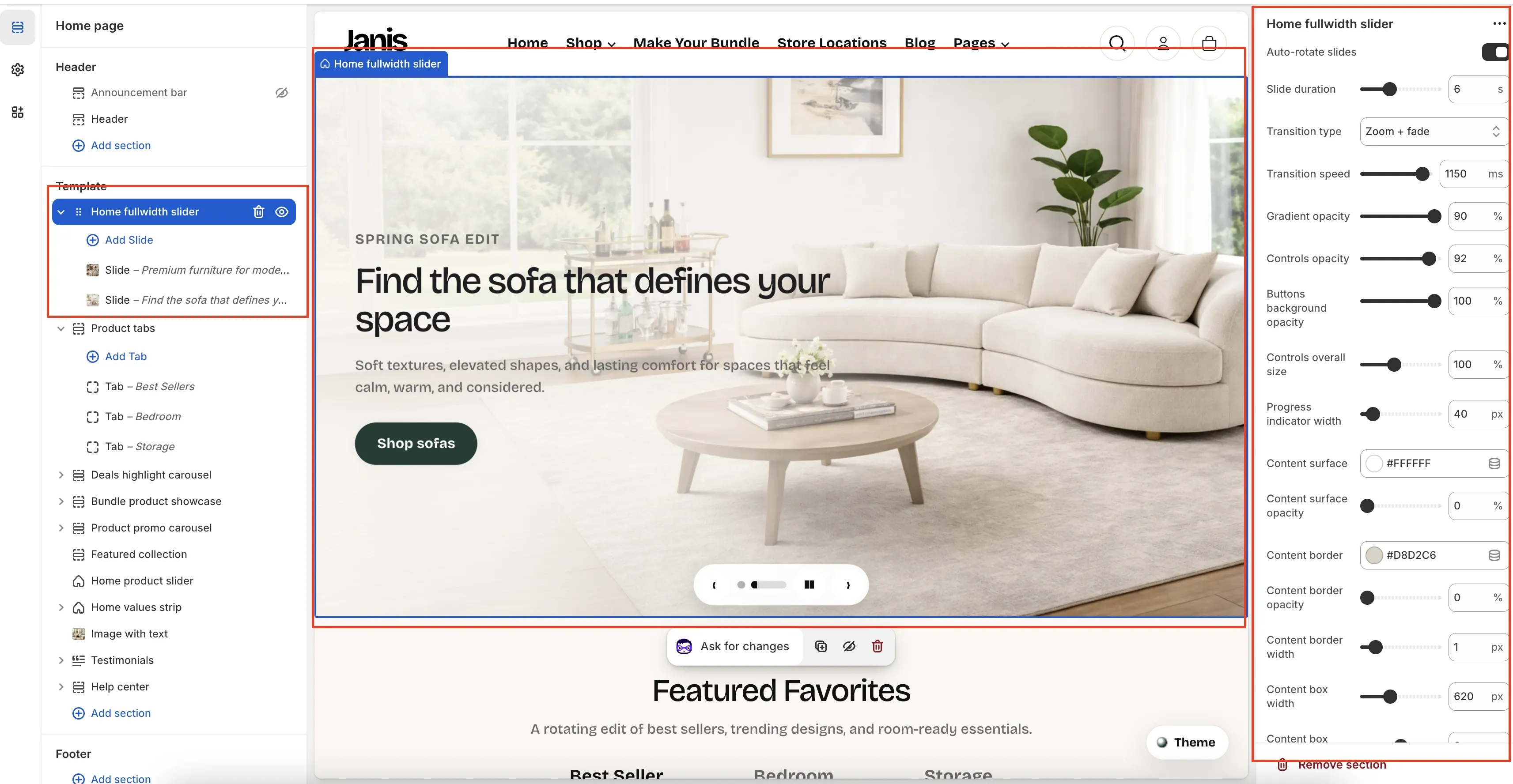
- In the left sidebar under Template, select Home fullwidth slider.
Editor Areas Overview
Section titled “Editor Areas Overview”Left sidebar (template tree)
Section titled “Left sidebar (template tree)”- Home fullwidth slider: the selected section instance on the homepage template.
- Add Slide: creates a new slide block inside this section.
- Slide blocks:
- Each block is one slide.
- Click a block to edit that specific slide content.
- Drag blocks to reorder slide sequence.
Center canvas (live preview)
Section titled “Center canvas (live preview)”- The blue outline marks the selected slider section.
- You can preview text, media, button styles, and control visibility in real time.
- Bottom controls in preview represent slider arrows, dots/progress, and play/pause behavior.
Right settings panel (section controls)
Section titled “Right settings panel (section controls)”The screenshot shows these section-level settings:
- Auto-rotate slides
- Slide duration (seconds)
- Transition type (
Fade,Slide,Slide from top,Zoom + fade) - Transition speed (milliseconds)
- Gradient opacity
- Controls opacity
- Buttons background opacity
- Controls overall size
- Progress indicator width
- Content surface (color)
- Content surface opacity
- Content border (color)
- Content border opacity
- Content border width
- Content box width
Section Controls: What Each One Does
Section titled “Section Controls: What Each One Does”- Auto-rotate slides: turns automatic slide movement on or off. Keep this off if your hero contains dense copy users need time to read.
- Slide duration: controls how long each slide stays visible before changing. Use a longer duration when slides have two buttons or longer text.
- Transition type: sets the motion style between slides (
Fade,Slide,Slide from top,Zoom + fade). Use subtler transitions for premium/editorial layouts. - Transition speed: controls animation time in milliseconds. Lower values feel snappier, higher values feel smoother but can feel slow if overused.
- Gradient opacity: adjusts overlay strength over media to improve text legibility. Increase this when image/video backgrounds are visually busy.
- Controls opacity: adjusts visibility of arrows, progress, and playback UI. Reduce it for minimal designs, increase it for accessibility and discoverability.
- Buttons background opacity: controls how solid the controls’ button backgrounds look. Higher opacity improves contrast over bright imagery.
- Controls overall size: scales slider controls globally. Increase on stores targeting mobile-heavy traffic or older audiences.
- Progress indicator width: sets how wide the progress/dot track appears. Wider values make navigation state easier to scan.
- Content surface: sets the panel background color behind text content. Choose a color that supports brand tone and contrast.
- Content surface opacity: controls transparency of the text panel background. Higher values improve readability over bright media.
- Content border: sets border color around the content panel. Useful for defining the panel edge on low-contrast backgrounds.
- Content border opacity: controls border visibility. Lower values are subtle; higher values create a stronger framed look.
- Content border width: sets border thickness. Keep thin for modern style, increase only if panel separation is weak.
- Content box width: controls maximum width of the text panel. Narrower widths improve readability; wider widths support longer copy blocks.
Slide Block Controls (When You Click A Slide)
Section titled “Slide Block Controls (When You Click A Slide)”Focus on these important controls for each slide:
- Media type (
Video assetorImage): choose motion-heavy storytelling (Video) or faster-loading visual clarity (Image). - Uploaded video / Image: primary visual asset for the slide. Use optimized media and consistent art direction across slides.
- Video asset filename: fallback/reference field for theme video asset handling; keep naming consistent for easier maintenance.
- Eyebrow + Show eyebrow: optional short pre-heading label for context (campaign tag, season, collection).
- Heading: main message on the slide. Keep concise so it remains readable across breakpoints.
- Text: supporting description. Use this to add value, not to repeat the heading.
- Content panel fill color + Content panel fill opacity: controls readability against the media background.
- Content panel border color + Content panel border opacity: helps separate content from background when contrast is low.
- Eyebrow color, Heading color, Body text color: set text contrast intentionally for accessibility.
- Heading size + Body text size: typography scale per slide; avoid oversized headings that wrap awkwardly on mobile.
Button label/link fields are intentionally omitted here because they are self-explanatory.
Common Merchant Tasks
Section titled “Common Merchant Tasks”Add a new slide
Section titled “Add a new slide”- Select Home fullwidth slider in sidebar.
- Click Add Slide.
- Configure media, text, and buttons for the new block.
- Drag to desired position.
- Save.
Reorder slides
Section titled “Reorder slides”- In the left sidebar, drag slide blocks up/down.
- Verify order in preview.
- Save.
Disable autoplay
Section titled “Disable autoplay”- Turn off Auto-rotate slides.
- Save.
Simplify visual chrome
Section titled “Simplify visual chrome”- Reduce Controls opacity and Buttons background opacity.
- Lower Gradient opacity if media appears too dark.
- Keep text contrast readable before publishing.
- Use 2-4 slides maximum to keep first-load messaging focused.
- Keep heading length consistent across slides for cleaner transitions.
- If readability is weak, increase panel opacity before increasing font size.
- Test autoplay and transition speed on mobile to avoid a “too fast” feel.
Why does slide text become hard to read on some images?
Section titled “Why does slide text become hard to read on some images?”Increase Gradient opacity and/or Content surface opacity, then check heading and body text colors.
Why does the slider feel too busy?
Section titled “Why does the slider feel too busy?”Reduce control opacity, simplify transitions (for example Fade), and limit the number of active buttons per slide.
Why are spacing and text wraps different on mobile?
Section titled “Why are spacing and text wraps different on mobile?”Check Content box width, Heading size, and Body text size for each slide block. Desktop-safe values can still wrap aggressively on smaller screens.
Related guides
Section titled “Related guides”Publish Checklist
Section titled “Publish Checklist”- Check all slide links.
- Check desktop and mobile preview.
- Confirm transition speed feels natural.
- Save and publish.
Need help?
Section titled “Need help?”If you still need help, contact support via the Contact page.