About Care Grid
What this section does
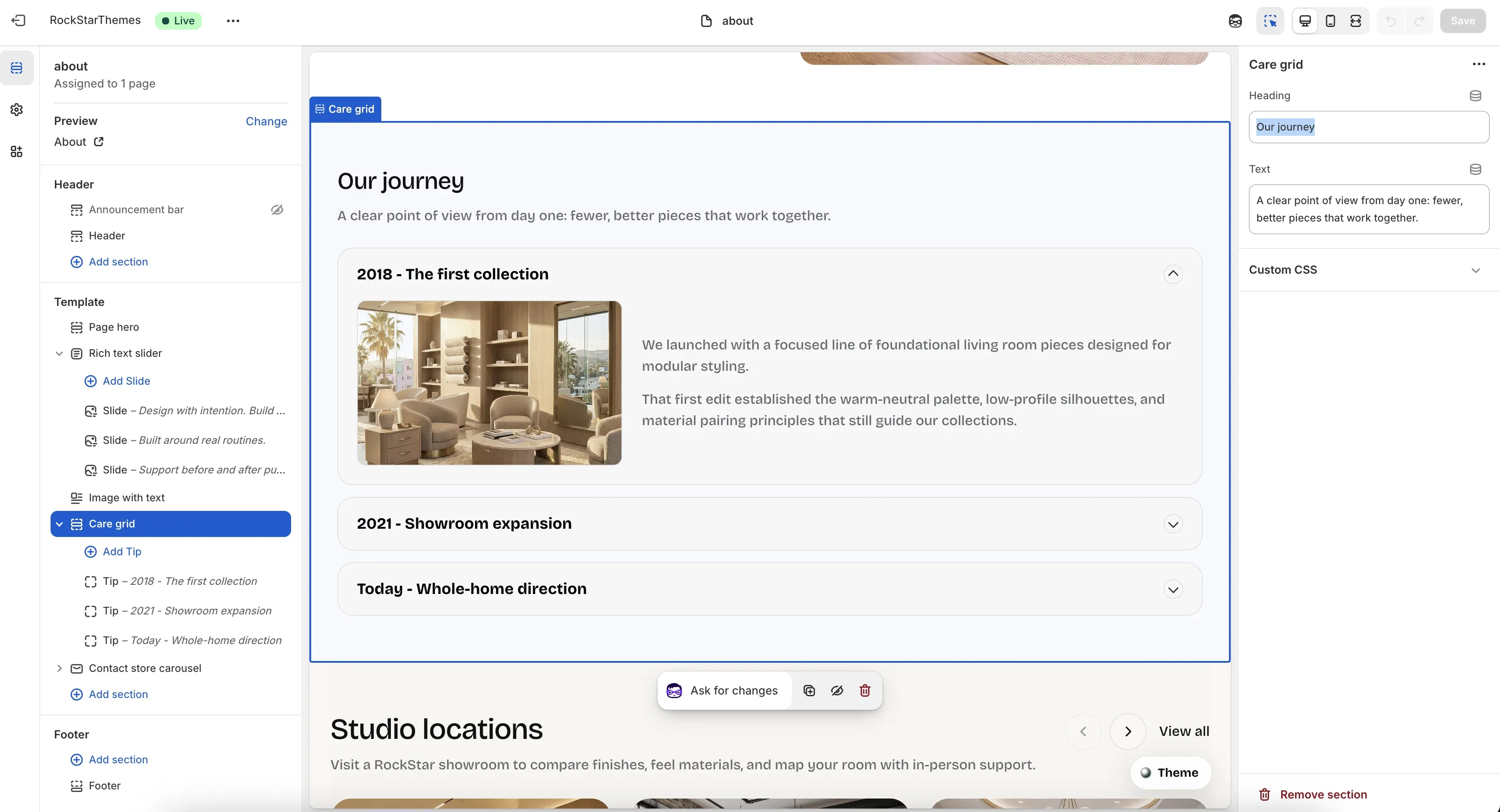
Section titled “What this section does”The Care grid section on the About template is used as an accordion timeline/grid for story blocks (for example: company milestones or journey steps). Each row expands to show image + rich text content.
Where it appears
Section titled “Where it appears”- Template: About (
templates/page.about.json). - Section instance in template:
milestones. - Section type:
care-grid. - Block type:
Tip.
How to set it up
Section titled “How to set it up”- Go to Online Store -> Themes.
- Click Customize.
- Open the About template/page.
- Select Care grid in the left sidebar.
- Add/edit/reorder Tip blocks.
- Save.
Section controls (important)
Section titled “Section controls (important)”When the section is selected:
- Heading: main section heading (example:
Our journey). - Text: supporting intro copy shown under the heading.
Tip block controls (important)
Section titled “Tip block controls (important)”When a single Tip block is selected:
- Title: accordion row title.
- Text: rich text body shown when expanded.
- Image: uploaded media for the expanded panel.
- Image asset filename: optional fallback image from theme assets (example:
store-la.jpg).
Behavior details
Section titled “Behavior details”- The first tip opens by default when the section loads.
- Opening one tip closes the others (single-open accordion).
- If no uploaded image is set, the section tries the
image_assetvalue. - If
image_assetis empty, it applies a built-in fallback by item index. - In Theme Editor, selecting a block opens that item automatically.
Common merchant tasks
Section titled “Common merchant tasks”Add a new milestone row
Section titled “Add a new milestone row”- Click Add Tip.
- Fill
TitleandText. - Add an image or set an asset filename fallback.
- Save.
Reorder timeline items
Section titled “Reorder timeline items”- Drag tip blocks in the left sidebar.
- Confirm order in preview.
- Save.
Replace fallback images with uploads
Section titled “Replace fallback images with uploads”- Open each tip block.
- Set an Image in the picker.
- Keep or clear
Image asset filenameas needed. - Save.
- Keep titles short so closed rows remain easy to scan.
- Use consistent image ratio/style across rows.
- Keep each text block to 1 to 2 short paragraphs.
- Test mobile view to verify readability when panels expand.
Why is a row image different from what I expected?
Section titled “Why is a row image different from what I expected?”If Image is empty, the section uses Image asset filename or index-based defaults.
Why are all rows not open at once?
Section titled “Why are all rows not open at once?”This component is intentionally single-open for cleaner reading.
Why does a row auto-open when editing?
Section titled “Why does a row auto-open when editing?”Theme Editor block selection triggers that row to open so content can be edited in context.