Home Product Slider
What this section does
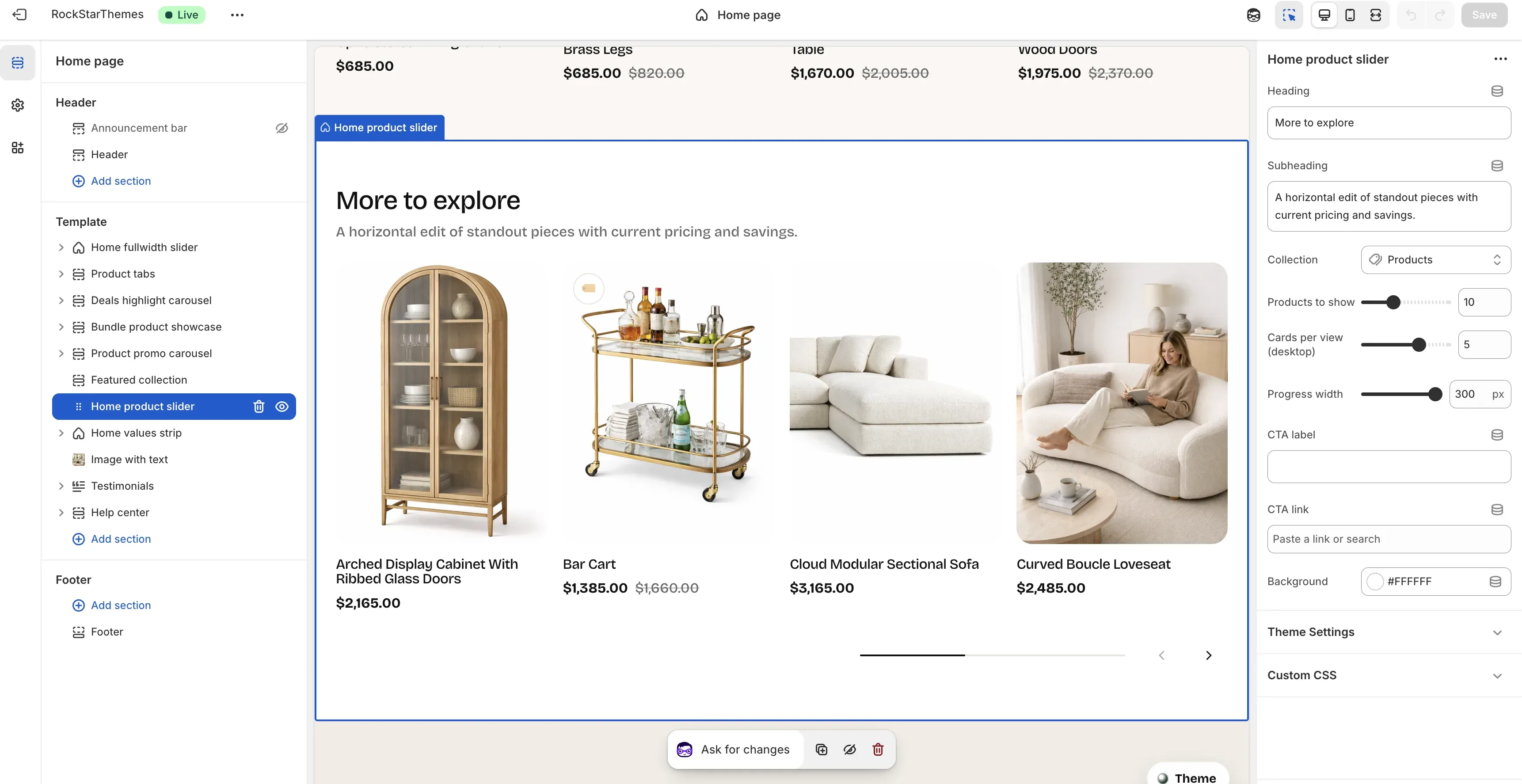
Section titled “What this section does”The Home product slider section shows a horizontally scrollable product row with pricing and sale compare values. It lets you control collection source, number of products, cards visible per desktop view, progress bar width, and optional CTA.
How to set it up
Section titled “How to set it up”- Go to Online Store -> Themes.
- Click Customize.
- Open the Home page template.
- In the left sidebar, select Home product slider.
- Configure collection, counts, layout controls, and CTA fields, then save.
Editor areas overview
Section titled “Editor areas overview”- Left sidebar:
- Shows the selected Home product slider section in the template tree.
- Center preview:
- Shows heading/subheading, product cards, and slider controls.
- Displays progress line plus previous/next buttons.
- Right settings panel:
- Section controls: Heading, Subheading, Collection, Products to show, Cards per view (desktop), Progress width, CTA label, CTA link, Background.
Key settings explained
Section titled “Key settings explained”- Heading: section title.
- Subheading: short supporting text below heading.
- Collection: product source for the slider.
- Products to show: total number of products loaded into the slider.
- Cards per view (desktop): number of cards visible at once on desktop widths.
- Progress width: width of the progress track in pixels.
- CTA label: text for the top-right button.
- CTA link: destination URL for CTA.
- Background: section background color.
Important behavior
Section titled “Important behavior”- If Collection is not set, the section falls back to all products.
- If CTA link is empty, CTA defaults to the selected collection URL.
- Sale and compare-at prices are shown automatically when product pricing supports it.
Common tasks
Section titled “Common tasks”Change product source
Section titled “Change product source”- Update Collection.
- Check product relevance/order in preview.
- Save.
Tune slider density
Section titled “Tune slider density”- Set Products to show.
- Adjust Cards per view (desktop) for readability.
- Verify desktop and mobile behavior.
- Save.
Adjust control footprint
Section titled “Adjust control footprint”- Change Progress width.
- Check balance between slider progress and nav buttons.
- Save.
- Keep heading/subheading concise so product cards stay dominant.
- Avoid very high card density on desktop unless imagery is simple and consistent.
- Ensure collection has enough in-stock products for the configured limit.
- Validate spacing and title wrapping at tablet width before publishing.
Why is the slider showing unexpected products?
Section titled “Why is the slider showing unexpected products?”If Collection is blank, the section can fall back to all products.
Why is CTA still clickable when CTA link is empty?
Section titled “Why is CTA still clickable when CTA link is empty?”The theme uses selected collection URL as CTA fallback when no explicit link is provided.
Why do some cards show both current and crossed-out prices?
Section titled “Why do some cards show both current and crossed-out prices?”Those products are on sale and include compare-at pricing.
Related guides
Section titled “Related guides”- Featured Collection Documentation
- Product Promo Carousel Documentation
- Product Tabs Documentation
- Theme Documentation
Publish checklist
Section titled “Publish checklist”- Confirm heading/subheading copy.
- Validate collection and product count.
- Confirm cards-per-view and progress width feel balanced.
- Verify CTA label/link behavior.
- Save and publish.
Need help?
Section titled “Need help?”If you still need help, contact support via the Contact page.