Deals Highlight Carousel
What this section does
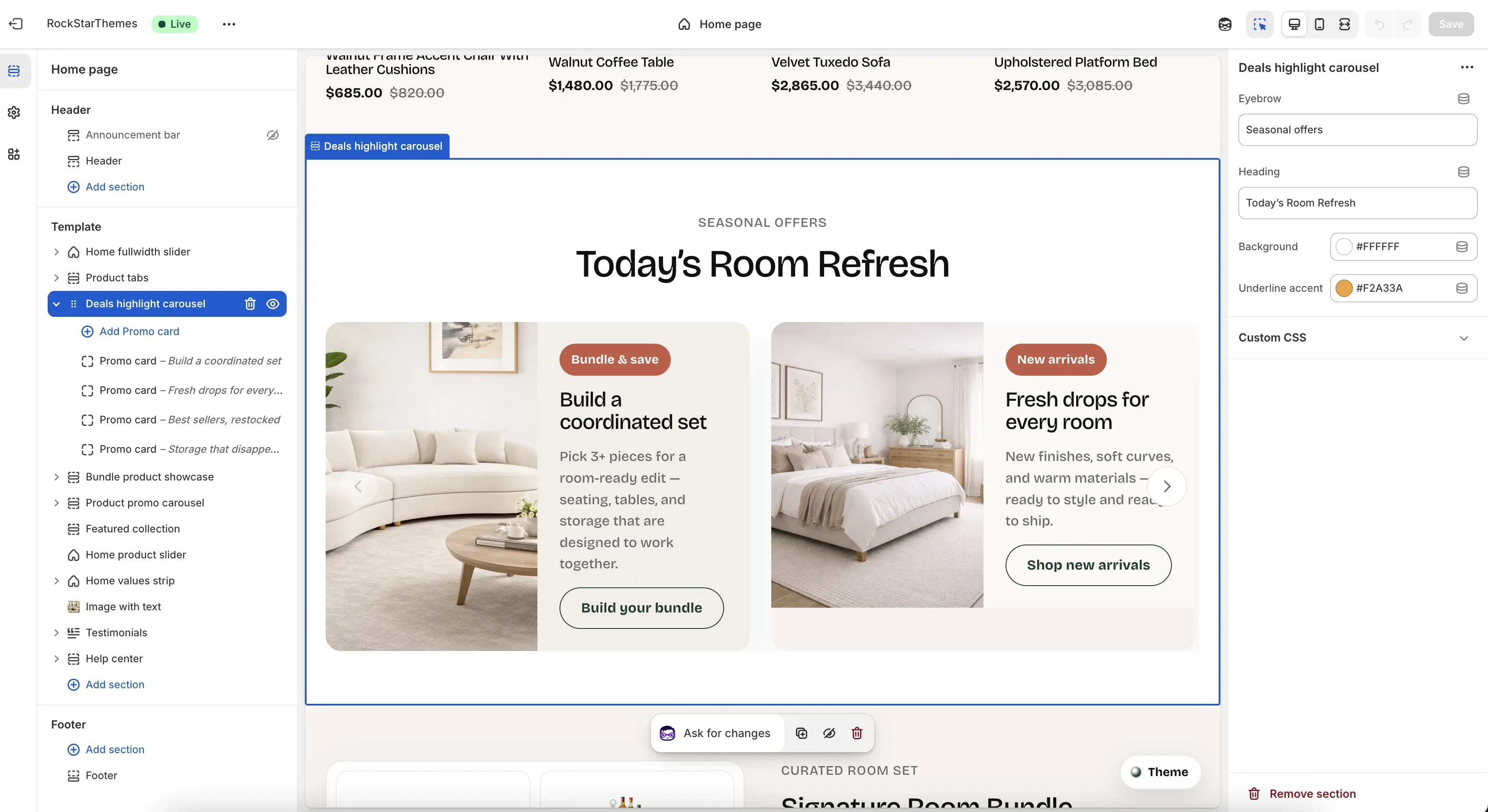
Section titled “What this section does”The Deals highlight carousel section displays an editorial-style set of promotional cards on the homepage. You can control the section heading area and each card’s media, layout, and messaging from Theme Editor.
How to set it up
Section titled “How to set it up”- Go to Online Store -> Themes.
- Click Customize.
- Open the Home page template.
- In the left sidebar, select Deals highlight carousel.
- Add or edit Promo card blocks, then save.
Editor areas overview
Section titled “Editor areas overview”- Left sidebar:
- Shows the selected section and all Promo card blocks.
- Add Promo card creates a new carousel card.
- Drag blocks to reorder card sequence.
- Center preview:
- Shows the live heading area plus visible cards.
- Arrows appear in desktop preview when enough cards exist.
- Right settings panel:
- Section-level controls: Eyebrow, Heading, Background, Underline accent.
- Card-level controls appear when a specific Promo card block is selected.
Key section settings explained
Section titled “Key section settings explained”- Eyebrow: small label above the main heading (for example, seasonal or campaign context).
- Heading: main section title displayed above the cards.
- Background: section background color behind heading and cards.
- Underline accent: accent color used by the section’s decorative underline treatment.
Promo card block settings
Section titled “Promo card block settings”Focus on these important settings for each Promo card block:
- Badge: short highlight label at the top of the card content.
- Heading: main card title.
- Text: supporting description for the offer.
- Link: destination URL for card media and CTA.
- Media type: switch between image-driven and video-driven cards.
- Image (or video poster): card visual for image mode, or poster image for video mode.
- Uploaded video / Theme asset video filename: video source options when media type is set to video.
- Image side: chooses whether media appears on the left or right side of the split card layout.
- Card background: per-card surface color for content/media blend.
Common tasks
Section titled “Common tasks”Add a new promo card
Section titled “Add a new promo card”- Select Deals highlight carousel.
- Click Add Promo card.
- Configure content, media, and link.
- Drag to desired position.
- Save.
Reorder cards
Section titled “Reorder cards”- Drag Promo card blocks in the left sidebar.
- Confirm order in preview.
- Save.
Switch a card from image to video
Section titled “Switch a card from image to video”- Open a specific Promo card block.
- Change Media type to Video.
- Add Uploaded video or a Theme asset video filename.
- Optionally set Image (or video poster) for poster fallback.
- Save and test playback behavior.
- Keep card headings short to avoid awkward wraps in two-column desktop cards.
- Use consistent image direction and crop style across cards for cleaner rhythm.
- If cards feel crowded, reduce total blocks or simplify per-card copy length.
- Test both desktop and mobile preview because cards stack on smaller screens.
Why do carousel arrows not appear?
Section titled “Why do carousel arrows not appear?”Arrows appear only when there are more than two promo cards.
Why is a fallback image or video showing instead of my custom media?
Section titled “Why is a fallback image or video showing instead of my custom media?”If selected media is missing, the section can fall back to built-in assets based on known link destinations. Upload explicit media in the block to guarantee the exact visual.
Why does the layout change on mobile?
Section titled “Why does the layout change on mobile?”On smaller screens, cards switch from split two-column layout to a stacked layout for readability.
Related guides
Section titled “Related guides”- Home Fullwidth Slider Documentation
- Product Tabs Documentation
- Header Documentation
- Theme Documentation
Publish checklist
Section titled “Publish checklist”- Check each promo card heading, text, and link destination.
- Confirm media renders correctly for every card.
- Verify order and visual consistency across cards.
- Test desktop and mobile preview, then save and publish.
Need help?
Section titled “Need help?”If you still need help, contact support via the Contact page.